Click here to interact with the full chart.
Author Katherine Santa Ana served as Graduate Library Pre-Professional (GLP), 2015-2017.
Sometimes, archives get a bad rap. Even more so than libraries, archives are often perceived as closed off and inaccessible. Closed stacks lack the “browsability” of a public library, where patrons can wander among the rows and go where their perusing takes them. In an archive, researchers must navigate a paper or digital finding aid –a detailed inventory of a collection of records—and narrow down their search to particular boxes. Then, they must request a staff member to pull the boxes on their behalf. If browsing a library is like a buffet, researching in an archive is like fishing. You never quite know what you will pull from the depths.
While learning the traditional approaches to archival research is rich and rewarding, for those uninitiated, looking through a finding aid or even a list of collections on an archives’ website can be daunting. Such a long list with so many words. What if there was another way to ease into full blown, archival research?
Data visualization is the presentation of information or data in graphic form; it can encompass a dynamic timeline, a beautiful infographic, or even a simple pie chart. These days, anyone with a WordPress blog or access to Google Analytics is familiar with data visualizations. Forums celebrating well-designed visualizations, like r/dataisbeautiful to name just one, are flourishing. David McCandless explains it best in his TED Talk, “The Beauty of Data Visualization:”
“There’s something almost quite magical about visual information. It’s effortless, it literally pours in. And if you’re navigating a dense information jungle, coming across a beautiful graphic or a lovely data visualization, it’s a relief, it’s like coming across a clearing in the jungle.”¹
Click here to interact with the full chart.
Perhaps archives and special collections can use data visualizations as easy on the eyes gateways into their holdings. After all, archives already have a surplus of data readily available. Most archives create detailed finding aids for their collections, which include important information such as the size of the collection, dates the collection encompasses, other related material, and much more. All archives need to do is gather already existing data and present it in a visually engaging way, and luckily, there are many free tools available to help! Here is how I went about it:
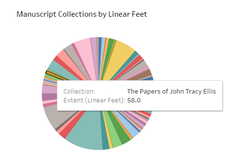
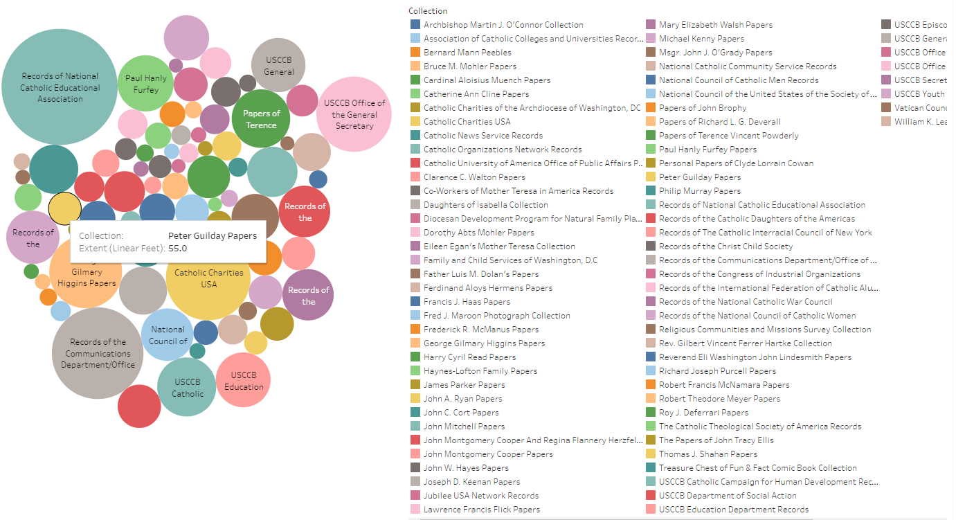
I decided to start with the low hanging fruit. I knew that the finding aids of the manuscript collections at The American Catholic History Research Center and University Archives each include the linear feet and the dates covered by each collection. For the staff here at the archives and perhaps even researchers, it would be intriguing to see how the collection sizes relate to each other and where the collections overlap in time. I also wanted to do a timeline; we have a list of the building dates of many of The Catholic University of America’s campus structures, general information about them, and historic photographs. This data could be of interest to the campus community and alumni if presented in a dynamic timeline.
To create my visualizations, I used two freely available tools: Tableau Public and TimeMapper. The Tableau Public website includes a variety of resources as well as a gallery of other users’ creations for inspiration. TimeMapper is much simpler. Their website is one page with user instructions and provides a Google Sheet template to enter your data. Timemapper offerss three options to portray your information: on a map, on a timeline, or both. Beautiful in its simplicity, Timemapper is also user friendly. Tableau Public, while a bit more complicated, gives users the flexibility to upload their data in a variety of formats and display it as a bubble chart, histogram, bar chart, and much more. What takes it beyond the average Excel chart is the ability to make a “dashboard” of interrelated charts, which can be dynamic, interactive, and colorful.

Click here to interact with the full timeline.
Using Tableau Public, I created a chart of Manuscript Collections by Date Range and Size as well as a Manuscript Collections by Size Bubble Chart. Using Timemapper, I created a CUA Early Buildings Timeline. The simple data spreadsheets used to create these visualizations are available below for reference:
Presenting data in this engaging format could help first time researchers visualize an archive and what it holds. At the very least, archive staff members can use data visualizations to view their collections in new ways and discover previously hidden patterns. Data visualizations could be an engaging tool to help archivists and researchers alike explore the information jungle of the archives.
¹McCandless, David. (2010). The beauty of data visualization. TED. Retrieved from http://www.ted.com/talks/david_mccandless_the_beauty_of_data_visualization/transcript?language=en