There is perhaps no more famous book to come out of the first age of printing (barring the Gutenberg Bible of course), than the Liber Chronicarum — or, as it is more commonly known, the Nuremberg Chronicle. Published by Anton Konberger in 1493, the Nuremberg Chronicle was an ambitious project even from its conception. Its goal was no less than to delineate a complete history of the world, (as understood by fifteenth-century Germans, by which we mean that there are a lot of historic figures wearing tights who maybe shouldn’t be) and its woodblocks were as beautiful as they were numerous. In the modern day, this book is considered a coveted collection piece and sales records show that it held the same status in its own day.
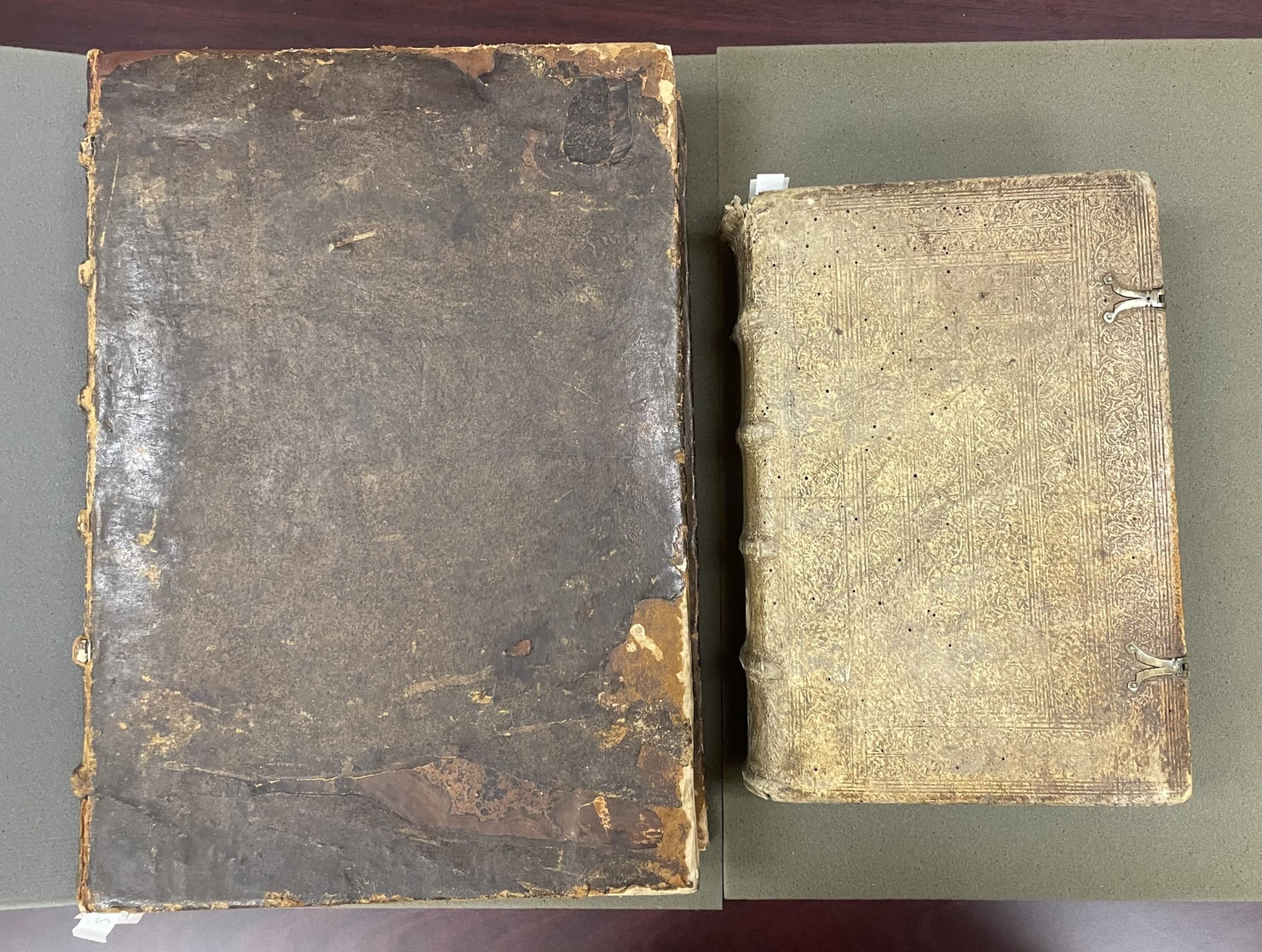
Indeed, the Nuremberg Chronicle was so popular that another publisher decided to step into the market. Johann Schönsperger published his own book in 1496, an impressive three years after the original. Using his press in Augsburg (His copy of the Nuremberg Chronicle is often called the Augsburg chronicle for this reason.), Schönsperger created a copy of less scale and quality, but that missed none of the material. While copyright and piracy laws did not exist in 15th century Germany (and indeed in many places until well into the Victorian period), Schönsperger’s Augsburg Chronicle does carry the familiar tells of a “bootlegged” copy , complete with the mirrored images and poor composition that one might see in a modern bootleg.
This feat is impressive for a number of reasons. The Nuremberg and Augsburg Chronicles are both examples of the period of books known as incunabula. Incunabula is a Latin word meaning “swaddling cloth” or “cradle”, and refers to books created in the infancy of printing. This period begins in 1450 with Gutenberg’s movable type, and ends in 1501, a somewhat arbitrary ending point which is placed around the time in which printers had begun to settle on standards for printed books. Schönsperger would have had to reset all the type by hand, and edit the layout to fit everything on a smaller scale. But this would have been a relatively easy challenge compared to the wood blocks. The original Nuremberg Chronicle contains 645 individual woodblocks, repeated for a total of 1806 illustrations — more than any book previously printed. Schönsperger misses none of them when laying out his copy.
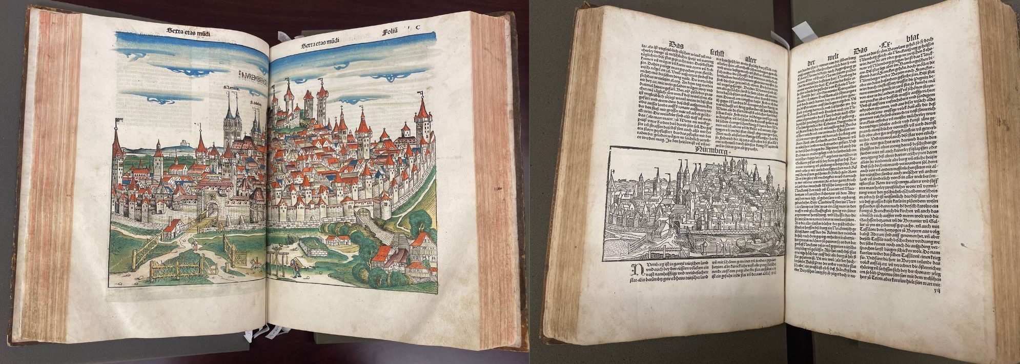
Naturally, these changes came at a cost. The Augsburg Chronicle makes good use of shorthand, in order to make the text fit into its more limited scope. More obviously to a reader who may not speak Latin or German (the Nuremberg Chronicle was published, and subsequently copied, in both languages) the wood blocks, while all present, have lost their positions of consequence. One need only compare the showstopping full page spread of the city of Nuremberg found in the Nuremberg Chronicle, with the Nuremberg block of the Augsburg Chronicle, which has now been relegated to a half a page, poorly placed and escaping the margins. One could argue that perhaps Schönsperger cared less about portraying the city well; he wouldn’t have any hometown pride about it, after all. While this may be true, there are examples of this throughout the text, with woodblocks placed in odd locations on the page, pressed too close to the text, or creeping beyond the framework and into the margins. The much simpler solution is space. Schönsperger simply did not have the paper (nor the money) to waste on a full page woodblock.
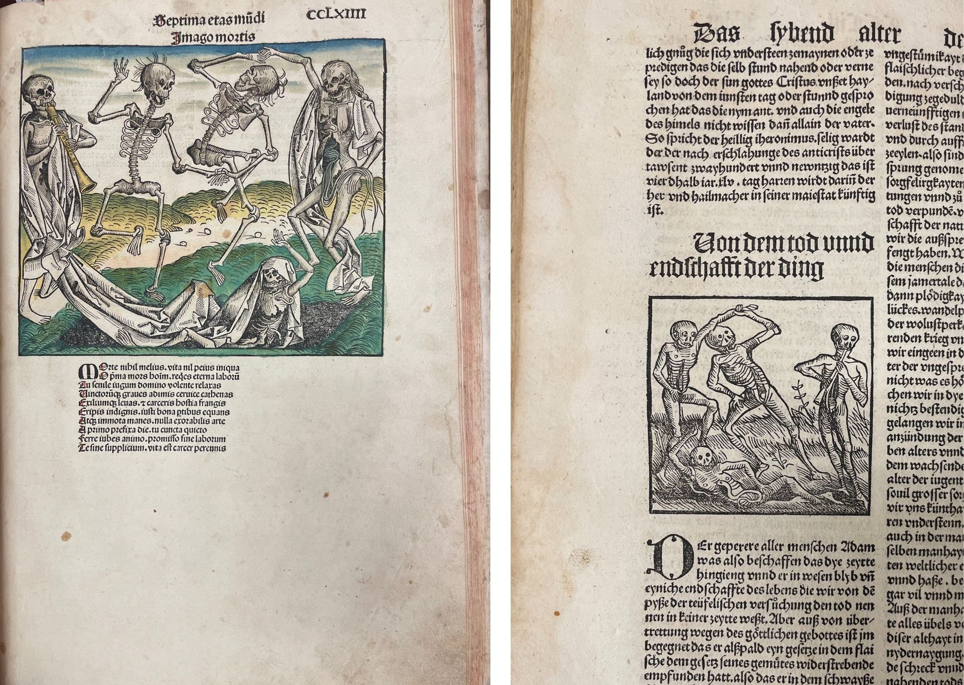
It would now be worth mentioning that smaller scale woodblocks, especially 645 of them, do not appear out of thin air. In order to remake every woodblock, one would need to copy and recarve each one. Schönsperger employed a team to do this, putting his best artists on the more famous blocks, such as the Nuremberg spread. This would have been difficult work as copying a picture onto a woodblock and then carving it would create a mirror image of the original print. Most of the prints do this very well. The Nuremberg print for instance, seems practically perfect. Yet some of the later prints, particularly those portraying Armageddon, have more of the quirks that make the Ausgurg Chronicle so interesting to look at. Take the Imago Mortis for instance, a relatively famous woodblock, and one of my personal favorites. The differences between the Nuremberg and Augsburg’s woodblocks are many, and here they betray the creativity of some of Schönsperger’s carvers. This is one of the mirrored woodblocks, and, of the major prints, it is the one with the most differences. The ways in which the carver changed the block to make a different and yet ultimately recognizable copy could be a shorthand for the ethos of the Augsburg copy as a whole. This is also one of the few woodblocks that fits perfectly into the boundaries of the text around it — evidently, removing that last skeleton was a good idea, at least for the layout.
Shortcuts such as these, cheaper paper, smaller woodblocks and the reduced size and quality of the book as a whole, meant that Schönsperger could also sell his books more cheaply, tapping into a market that buyers would otherwise have been priced out of. And sell they did. Indeed some scholars argue that Schönsperger’s sale records may have contributed to the less than expected success of the Nuremberg Chronicle.
Everything about the Nuremberg Chronicle tells the viewer that it is a work of art. Even without the pricey figure attached to it, its beautiful woodblocks and artful design layouts garner it a certain amount of careful respect. The Augsburg Chronicle, on the other hand, was made to be a cheaper option for people who really needed it. It was made to be used, and, while there is no material lack in its printing, it is certainly not as artfully done. Despite all of this, to call the Augsburg a cheap knock-off of its original would be reductive. One can also see the artistry of the Augsburg Chronicle through the ingenuity Schönsperger had to exert to make it work. While the Nuremberg Chronicle is a masterpiece, the Augsburg Chronicle provides us valuable insight in its own right. In a way, it was one of the first pieces to offer commentary on the Nuremberg Chronicle, by being an outside interpretation of it. Additionally, providing access to a new market reveals just how popular the Nuremberg Chronicle really was, and how valuable its content was deemed. By comparing the two books, one gains a better understanding of the readership of Schedel’s text as a whole, and a greater appreciation for the artistry of both books.
If you wish to visit either book, both are available in our Rare Books department. Email lib-rarebooks@cua.edu to make an appointment.